![]()
![]()
Predictors of Upward Mobility for Fresno, California
Fresno Demographics:
How to Download Charts and Data
All charts and maps in the dashboard include a download button that lets you save the underlying data as a CSV file.
For downloading images of the charts, there are two options depending on the chart:
- The camera icon in the toolbar: For most charts, when you hover over the chart or click on it, a toolbar appears in the chart’s top-right corner (see image below). Clicking the camera icon will save the chart as a PNG image. Note that if you interact with the chart, by zooming in, filtering, or otherwise adjusting the view, the saved image will reflect those adjustments.
![]()
- Image download button below the chart: The maps and a handful of charts include a button that saves a static image of the chart as a PNG file.
For more information on data sources, the Urban Institute’s Upward Mobility Framework, and dashboard methodology, see the Use the Data page.
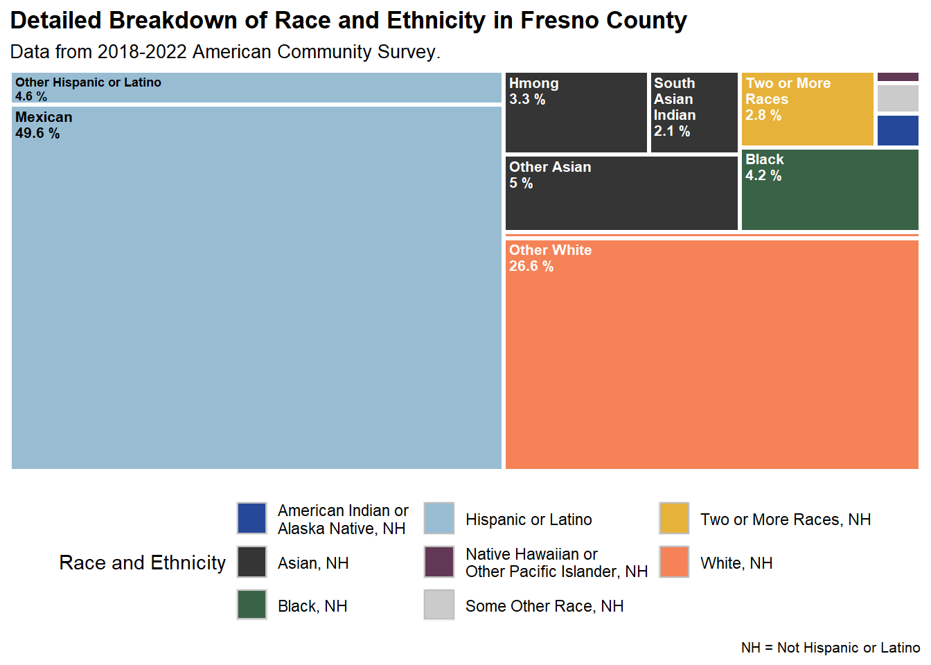
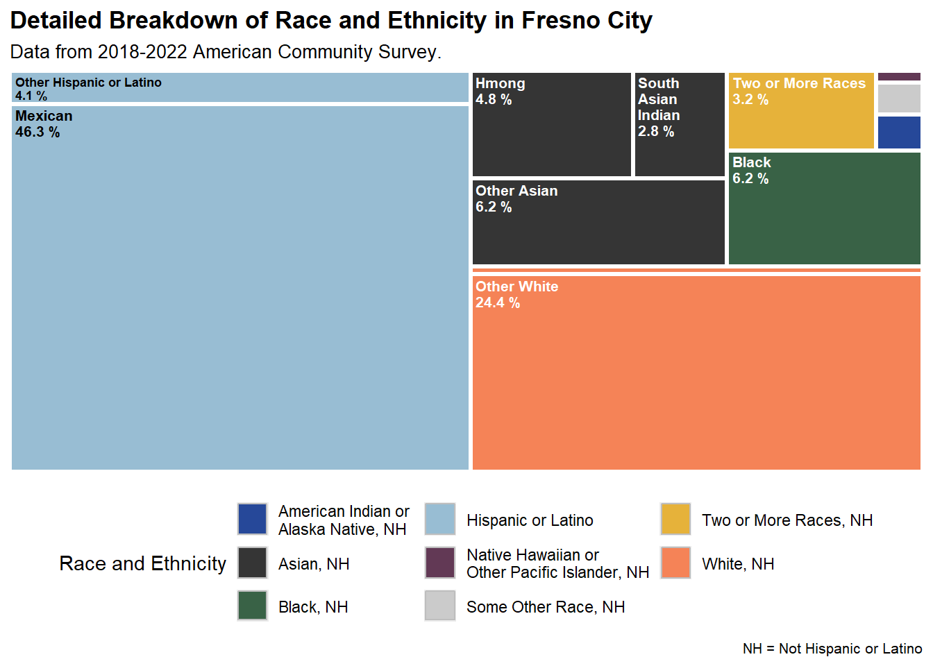
Race and Ethnicity Overview
Click the image above to expand
Click the image above to expand
Comparing Fresno Race and Ethnicities over Time
Race and Ethnicity in Fresno (county), CA
Race and Ethnicity in Fresno (county), CA
Mexican population in Fresno (county), CA
Population Estimates for race and ethnicity subgroups, 2010 - 2021
Asian Indian population in Fresno (county), CA
Population Estimates for race and ethnicity subgroups, 2010 - 2021
Hmong population in Fresno (county), CA
Population Estimates for race and ethnicity subgroups, 2010 - 2021
Mexican population in Fresno (city), CA
Population Estimates for race and ethnicity subgroups, 2010 - 2021
Asian Indian population in Fresno (city), CA
Population Estimates for race and ethnicity subgroups, 2010 - 2021
Hmong population in Fresno (city), CA
Population Estimates for race and ethnicity subgroups, 2010 - 2021
Source(s) and notes:
Source: 5-year 2019-2023 American Community Survey data (treemap plots) and 5-year 2008-2012, 2013-2017, and 2021-2023 American Community Survey data (line charts).
Notes: The charts above show the racial and ethnic breakdown of Fresno City and Fresno County from the 2008-2012, 2013-2017, and 2019-2023 5-year American Community Survey data. 2019-2023 data is the most recently available data at the time of the dashboard’s most recent update. The subgroups shown are identified by the Census. We include Hmong, Asian Indian, and Mexican because they compose a large share of Fresno’s population and because they are reliable (see below for more details).
The Boosting Upward Mobility framework includes a “Descriptive Representation” predictor which is defined as the “[r]atio of the share of local elected officials of a racial or ethnic group to the share of residents of the same racial or ethnic group.” Instead of collecting demographic information from elected officials, this dashboard shows a more detailed racial and ethnic breakdown of Fresno. You can a list see Fresno (county)’s elected officials here and learn more about them at the county registrar website.
There is inherent unreliability in American Community Survey data because it is a survey that samples the population. To determine whether or not to visualize racial or ethnic subgroups, we use the Coefficient of Variation (CV) where \(CV = standard error/ estimate\). While there is not a hard and fast rule, academic literature suggests that data with a CV below .12 can be considered “highly reliable,” and a CV between .12 and .40 can be considered to have “medium reliability.” In general, all data plotted is of “high reliability,” but two exceptions to this are made. First, the county-level Hispanic data from the American Community Survey data pulled is missing margin of error columns. However, the Fresno city-level Hispanic data has a CV below .12, and the county is a larger geography. This suggests that the CV would also fall below .12. Second, the Some Other Race data at the county scale and the Some Other Race, American Indian or Alaska Native, and Native Hawaiian or Other Pacific Islander data tend to have “medium reliability.” Consequently, for these charts, error bars are also plotted. Even so, incorporating these populations into the dashboard is important so that all people viewing the it can see themselves to at least some extent in these charts. Lastly, note that the Census Bureau reports that interpreting changes over time can be challenging due to changes in weighting methodology and the tendency of multi-year estimates to smooth out sudden changes.
Inclusive Recovery Indices:
How to Download Charts and Data
All charts and maps in the dashboard include a download button that lets you save the underlying data as a CSV file.
For downloading images of the charts, there are two options depending on the chart:
- The camera icon in the toolbar: For most charts, when you hover over the chart or click on it, a toolbar appears in the chart’s top-right corner (see image below). Clicking the camera icon will save the chart as a PNG image. Note that if you interact with the chart, by zooming in, filtering, or otherwise adjusting the view, the saved image will reflect those adjustments.
![]()
- Image download button below the chart: The maps and a handful of charts include a button that saves a static image of the chart as a PNG file.
For more information on data sources, the Urban Institute’s Upward Mobility Framework, and dashboard methodology, see the Use the Data page.
Fresno Rank on Overall Inclusion Among 274 Large American Cities
Where higher ranks indicate less inclusive cities
Fresno Rank on Racial Inclusion Among 274 Large American Cities
Where higher ranks indicate less inclusive cities
Fresno Rank on Economic Inclusion Among 274 Large American Cities
Where higher ranks indicate less inclusive cities
Fresno Rank on Overall Inclusion Among 59 Large California Cities
Where higher ranks indicate less inclusive cities
Fresno Rank on Racial Inclusion Among 59 Large California Cities
Where higher ranks indicate less inclusive cities
Fresno Rank on Economic Inclusion Among 59 Large California Cities
Where higher ranks indicate less inclusive cities
Source(s) and notes:
Source: The Inclusive Recovery Indices were developed by the Urban Institute. The data presented here is a compilation of metrics previously developed for the years 1980, 1990, 2000, 2013, and 2016. That data can be downloaded here. Index results from 2020 were developed specifically for this project.
Notes: The economic inclusion index is a combination of four variables capturing the following concepts: income segregation, rent burden, working poor, and percent 16- to 19-year-olds who are not enrolled in school and are not high school graduates. The racial inclusion index is composed of variables capturing the following five concepts: racial segregation, percentage people of color, poverty gap between Non-Hispanic White people and people of color, racial education gap between Non-Hispanic White people and people of color, and homeownership gap between Non-Hispanic White people and people of color. The overall inclusion index is a combination of the four economic inclusion indices and the five racial inclusion indices. The 274 cities were selected because they had populations greater than 100,000 in any decade between 1970 and 2010. The cities also were required to be “incorporated,” meaning that they have municipal governments. To read more about the creation of these metrics, please see this Urban Institute report.
Prosperity:
How to Download Charts and Data
All charts and maps in the dashboard include a download button that lets you save the underlying data as a CSV file.
For downloading images of the charts, there are two options depending on the chart:
- The camera icon in the toolbar: For most charts, when you hover over the chart or click on it, a toolbar appears in the chart’s top-right corner (see image below). Clicking the camera icon will save the chart as a PNG image. Note that if you interact with the chart, by zooming in, filtering, or otherwise adjusting the view, the saved image will reflect those adjustments.
![]()
- Image download button below the chart: The maps and a handful of charts include a button that saves a static image of the chart as a PNG file.
For more information on data sources, the Urban Institute’s Upward Mobility Framework, and dashboard methodology, see the Use the Data page.
Employment opportunities: Employment-to-population ratio for adults ages 25 to 54
Source(s) and notes:
Source (County): US Census Bureau 2023 1-year American Community Survey, Public Use Microdata Sample (via IPUMS; Missouri Census Data Center Geocorr 2022: Geographic Correspondence Engine. (Time period: 2023).
For over time data (line graphs), US Census Bureau 5-year American Community Surveys are used. We label the 5-year estimates by their middle year. For example, we label 2017-2021 5-year estimates as 2019 in the line charts.
Notes (County): The share of adults between the ages of 25 and 54 in a given community who are employed. People are classified as employed if they do any work for pay (at least one hour in the past week) at a job or business, outside of time they might temporarily spend on leave (e.g., vacation or maternity leave). Work includes work for someone else for wages, salary, and tips or other payments; work in one’s own business, professional practice, or farm; any part-time work; and active duty in the Armed Forces.
This metric is comparable with the employment-to-population ratio used by the Bureau of Labor Statistics. However, unlike the BLS metric, which measures employment among people ages 16 and older, we focus on people ages 25 to 54. This age range better reflects those most likely to be in the workforce.
Source (City): US Census Bureau 2023 1-year American Community Survey, Public Use Microdata Sample (via IPUMS; Missouri Census Data Center Geocorr 2022: Geographic Correspondence Engine. (Time period: 2023).
For over time data (line graphs), US Census Bureau 5-year American Community Surveys are used. We label the 5-year estimates by their middle year. For example, we label 2017-2021 5-year estimates as 2019 in the line charts.
Notes (City): The share of adults between the ages of 25 and 54 in a given community who are employed. People are classified as employed if they do any work for pay (at least one hour in the past week) at a job or business, outside of time they might temporarily spend on leave (e.g., vacation or maternity leave). Work includes work for someone else for wages, salary, and tips or other payments; work in one’s own business, professional practice, or farm; any part-time work; and active duty in the Armed Forces.
This metric is comparable with the employment-to-population ratio used by the Bureau of Labor Statistics. However, unlike the BLS metric, which measures employment among people ages 16 and older, we focus on people ages 25 to 54. This age range better reflects those most likely to be in the workforce.
Jobs paying living wages: Ratio of pay on average job to the cost of living
Source(s) and notes:
Source (County): US Bureau of Labor Statistics, Quarterly Census of Employment and Wages data, 2023; Living Wage Institute, Inc. “Benchmark Living Wage Data Series,” 2024. (Time period: 2023).
For over time data (line graphs), the 2014 and 2018 values are calculated using 2019 Living Wage data deflated to 2014 and 2018 using the consumer price index (for all urban consumers) for a correct comparison with the Quarterly Census of Employment and Wages for these years.
The 2021 value is calculated using deflated 2022 Living Wage data to 2021 using the consumer price index (for all urban consumers) for a correct comparison with the 2021 Quarterly Census of Employment and Wages.
The 2022 and 2023 values are calculated using 2024 Living Wage data deflated to 2022 and 2023 using the consumer price index (for all urban consumers) for a correct comparison with the Quarterly Census of Employment and Wages for these years.
Notes (County): This metric reflects what an average job pays relative to the cost of living in a particular area. It is computed by dividing the average earnings for a job in an area by the cost of meeting a family of three’s (for a 1 adult and 2 child household) basic expenses in that area. Ratio values greater than 1 indicate that the average job pays more than the cost of living, while values less than 1 suggest the average job pays less than the cost of living.
To estimate the living wage for a given year, the Living Wage Institute calculates costs for eight basic needs: child care, civic engagement, food, health care, housing, internet and mobile, transportation, and other necessities plus income and payroll taxes. It assesses employment earnings that a full-time worker needs to cover the cost of their family’s basic needs where they live while still being self-sufficient.
Starting in 2023, living wage estimates use an updated methodology that will make it easier to compare estimates across years going forward. Data for 2023 and subsequent years include a civic engagement cost and internet and mobile costs, which were not previously included in living wage estimates, and an updated child care cost calculation. As a result, data from before 2023 may not be comparable with data from 2023 and after.
Income: Household income at 20th, 50th, and 80th percentiles
20th percentile
50th percentile
80th percentile
20th percentile
50th percentile
80th percentile
20th percentile
50th percentile
80th percentile
20th percentile
50th percentile
80th percentile
Do you want to see related data visualized spatially? You can see maps showing Fresno tract-level income at the 20th, 40th, 60th, and 80th percentiles on the Map page.
Source(s) and notes:
Source (County): US Census Bureau 2023 5-Year American Community Survey (via IPUMS); Missouri Census Data Center Geocorr 2022: Geographic Correspondence Engine. (Time Period: 2019-2023).
For over time data (line graphs), we label the 5-year estimates by their middle year. For example, we label 2016-2020 5-year estimates as 2018 in the line charts.
Notes (County): To identify income percentiles, all households are ranked by income from lowest to highest. The income level threshold for the poorest 20 percent of households is the value at the 20th percentile. The 50th percentile income threshold indicates the median, with half of households earning less and half of households earning more. The income level threshold for the richest 20 percent of households is the value at the 80th percentile. The difference in income between households at the 20th percentile and the 80th percentile illustrates the level of local economic inequality.
Household income includes the total income of all household members 15 and older during the previous year. Income includes wages, salaries, tips, commissions, bonuses, public assistance income, and more.
Disaggregated data are not available for 2015, 2017, 2019, 2020, and 2022.
Source (City): US Census Bureau 2023 5-Year American Community Survey (via IPUMS); Missouri Census Data Center Geocorr 2022: Geographic Correspondence Engine. (Time Period: 2019-2023).
For over time data (line graphs), we label the 5-year estimates by their middle year. For example, we label 2016-2020 5-year estimates as 2018 in the line charts.
Notes (City): To identify income percentiles, all households are ranked by income from lowest to highest. The income level threshold for the poorest 20 percent of households is the value at the 20th percentile. The 50th percentile income threshold indicates the median, with half of households earning less and half of households earning more. The income level threshold for the richest 20 percent of households is the value at the 80th percentile. The difference in income between households at the 20th percentile and the 80th percentile illustrates the level of local economic inequality.
Household income includes the total income of all household members 15 and older during the previous year. Income includes wages, salaries, tips, commissions, bonuses, public assistance income, and more.
Disaggregated data are not available for 2015, 2017, 2019, 2020, and 2022.
Additional Interpretation: For example, household income is the lowest for Black, Non-Hispanic households in New Orleans, LA and Detroit, MI and for Hispanic households in Buffalo, NY (<$12,000, found in the 20th percentile graph).
Household income is the highest for White, Non-Hispanic households in San Francisco, CA (>$360,000, found in the 80th percentile graph).
The largest racial disparities for this metric among the cities and counties shown in the dashboard exist between White, Non-Hispanic and Black, Non-Hispanic households for the 20th percentile (>$50,000 difference) and 50th percentile graphs (>$125,000 difference).
Fresno’s (city and county) average income across all races and ethnicities is below an estimate of the average income across the state of California.
People:
How to Download Charts and Data
All charts and maps in the dashboard include a download button that lets you save the underlying data as a CSV file.
For downloading images of the charts, there are two options depending on the chart:
- The camera icon in the toolbar: For most charts, when you hover over the chart or click on it, a toolbar appears in the chart’s top-right corner (see image below). Clicking the camera icon will save the chart as a PNG image. Note that if you interact with the chart, by zooming in, filtering, or otherwise adjusting the view, the saved image will reflect those adjustments.
![]()
- Image download button below the chart: The maps and a handful of charts include a button that saves a static image of the chart as a PNG file.
For more information on data sources, the Urban Institute’s Upward Mobility Framework, and dashboard methodology, see the Use the Data page.
Educational achievement: Mathematics
Source(s) and notes:
Source: School Year 2022-2023: California Assessment of Student Performance and Progress (CAASPP) Smarter Balanced Assessments for students grades 3 - 11 (all available). Data collected via the California Department of Education website.
For over time data (line graphs), we label the year as the ending semester of the school year. This aligns with the timing of the test which is held every spring. For example, “2015” is the label for the 2014-2015 school year.
Notes: The charts show the percentage of students who met or exceeded standards in CAASPP for grades 3-11 in Mathematics.
This dataset was not included in original Upward Mobility dataset. It provides additional context on California students’ educational performance. No data is available for “2020” (2019-2020 school year) due to the COVID-19 pandemic. Data was collected from the “statewide” files and subsequently filtered to include only counties and the state of California as a whole. The data and documentation do not clarify whether racial groups are Hispanic. For example, the “White” group in the data is not said to be either “Non-Hispanic White” or to include Hispanic Whites.
“AIAN” stands for “American Indians and Alaska Natives.” “NHPI” stands for “Native Hawaiians and Pacific Islanders.”
Educational achievement: English language arts
Source(s) and notes:
Source: School Year 2022-2023: California Assessment of Student Performance and Progress (CAASPP) Smarter Balanced Assessments for students grades 3 - 11 (all available). Data collected via the California Department of Education website.
For over time data (line graphs), we label the year as the ending semester of the school year. This aligns with the timing of the test which is held every spring. For example, “2015” is the label for the 2014-2015 school year.
Notes: The charts show the percentage of students who met or exceeded standards in CAASPP for grades 3-11 in English Language Arts/Literacy.
This dataset was not included in original Upward Mobility dataset. It provides additional context on California students’ educational performance. No data is available for “2020” (2019-2020 school year) due to the COVID-19 pandemic. Data was collected from the “statewide” files and subsequently filtered to include only counties and the state of California as a whole. The data and document ation do not clarify whether racial groups are Hispanic. For example, the “White” group in the data is not said to be either “Non-Hispanic White” or to include Hispanic Whites.
“AIAN” stands for “American Indians and Alaska Natives.” “NHPI” stands for “Native Hawaiians and Pacific Islanders.”
Access to Health Services: Ratio of population per primary care physician
Source(s) and notes:
Source (County): US Department of Health and Human Services, Health Resources and Services Administration, Area Health Resources File, 2021 (using 2021-2022, 2022-2023 files) (using American Medical Association Physician Masterfile). (Time period: 2021)
For over time data (line graphs), the same dataset is used. We label year based on the beginning year of the dataset range. For example, “2021” is the label for the 2021-2022 dataset.
Notes (County): The ratio represents the number of people served by one primary care physician in a county. It assumes the population is equally distributed across physicians and does not account for actual physician patient load. Missing values are reported for counties with population greater than 2,000 and 0 primary care physicians. The metric does not include nurse practitioners, physician assistants, or other primary care providers who are not physicians.
Safety from Trauma: Number of deaths caused by injury per 100,000 people
Source(s) and notes:
Source (County): Centers for Disease Control and Prevention, National Center for Health Statistics, Division of Vital Statistics, Mortality data, 2023 (via CDC WONDER). (Time period: 2023)
For over time data (line graph), each labeled year includes the data from that calendar year. We provide data for each individual year from 2021-2023.
Notes (County): This metric includes planned deaths, such as homicides or suicides, and unplanned deaths, such as from motor vehicle and other accidents. Deaths caused by injury are counted by the deceased person’s county of residence, not the county where the death occurred.
In May 2025, we shifted from using age-adjusted mortality rates to using crude mortality rates for all years of data because of a lack of available data. More information on age-adjusted and crude rates can be found in CDC WONDER’s documentation.
Crude mortality rates disaggregated by race and ethnicity are not available before 2020.
Place:
How to Download Charts and Data
All charts and maps in the dashboard include a download button that lets you save the underlying data as a CSV file.
For downloading images of the charts, there are two options depending on the chart:
- The camera icon in the toolbar: For most charts, when you hover over the chart or click on it, a toolbar appears in the chart’s top-right corner (see image below). Clicking the camera icon will save the chart as a PNG image. Note that if you interact with the chart, by zooming in, filtering, or otherwise adjusting the view, the saved image will reflect those adjustments.
![]()
- Image download button below the chart: The maps and a handful of charts include a button that saves a static image of the chart as a PNG file.
For more information on data sources, the Urban Institute’s Upward Mobility Framework, and dashboard methodology, see the Use the Data page.
Housing Affordability: Ratio of affordable and available housing units to available housing units for households with 30%, 50%, and 80% of Area Median Income (AMI)
Source(s) and notes:
Source: US Department of Housing and Urban Development, Office of Policy Development and Research, Fair Market Rents and Income Limits, FY 2023; US Census Bureau 2023 1-Year American Community Survey, Public Use Microdata Sample (via IPUMS); Missouri Census Data Center Geocorr 2022: Geographic Correspondence Engine. (Time period: 2023)
Notes: This metric reflects the availability of housing options for households with low incomes. It reports the number of housing units that are affordable and available for every 100 households with low-incomes (below 80 percent of area median income, or AMI), very low-incomes (below 50 percent of AMI), and extremely low-incomes (below 30 percent of AMI) relative to every household with these income levels.
Income groups are defined for a local family of 4. Housing is considered affordable when monthly costs fall at or below 30 percent of a household’s income. A unit is affordable and available at a given income level if it (1) meets our definition of affordable for that income level and (2) is either vacant or occupied by a renter or owner with the same or a lower income.
Values above 1.0 suggest that there are more affordable housing units than households with those income levels. Affordability addresses whether sufficient housing units would exist if allocated solely on the basis of cost, regardless of whether they are currently occupied by a household that could afford the unit. Ratios below 1.0 suggest that on this basis the affordable stock is insufficient to meet the need. The affordable housing stock includes both vacant and occupied units.
Additional Interpretation: For example, for Fresno County, there are only 28 affordable and available housing units at the 30% AMI (extremely low-income) level per 100 households. However, the ratio of affordable and available housing units increases with income, there are 42 affordable and available housing units at the 50% AMI (very low-income) level, and 74 at the 80% AMI (low-income) level. There are no counties and cities in our comparison geographies in which there are sufficient affordable and available housing units for these lower income groups.
Environmental Quality: Air quality index
Source(s) and notes:
Source: US Environmental Protection Agency Air Toxics Screening Assessment data, 2019. (Time period: 2018 - 2019).
For over time data (line graphs), individual assessment year data is reported.
Notes: The index is a linear combination of standardized EPA estimates of air quality carcinogenic, respiratory, and neurological hazards measured at the census tract level. Values are inverted and percentile ranked nationally and range from 0 to 100. The higher the index value, the less exposure to toxins harmful to human health.
‘Majority’ means that at least 60% of residents in a census tract are members of the specified group. ‘High poverty’ means that 40% or more of people in a census tract live in families with incomes below the federal poverty line.
Water Quality: Drinking water contaminants
Source(s) and notes:
Source (County): CalEnviroScreen V4 (2021) which include 5-year American Community Survey Data from 2015-2019 and water contaminant data from 2011 - 2019.
Notes (County): The data shown comes from the tract-level percentile rank of CalEnviroScreen’s drinking water contaminants index. The higher the value, the higher the level of water contamination relative to California regions.
While this data was released in 2021, water contaminant data incorporated into the creation of this metric were collected from 2011 to 2019. To calculate the county-level metric, we generated a population-weighted average of the census tracts within the county (or across all of California, for the state-level measure). We use the 2015-2019 5-year American Community Survey data incorporated into the CalEnviroScreen data for these calculations. This weighted average approach is similar to that taken to aggregate the Transit trips index.
While there are previous CalEnviroScreen versions, the most recently published version, Version 4, made methodological changes to the calculation of the drinking water hazards. Consequently, we do not make temporal comparisons with earlier versions of the data.
Just Policing: Rate of juvenile justice arrests
Source(s) and notes:
Source: Federal Bureau of Investigations, National Incident-Based Reporting System (in Jacob Kaplan’s 2025 Arrestee Segment), Harvard Dataverse V1, 2023; US Census Bureau 2023 5-Year American Community Survey. (Time period: 2023).
For over time data (line graphs), we provide data for years 2021, 2022, and 2023.
Notes: This metric reflects arrests of juveniles (defined as those aged 10 to 17) for any crime or offense status. Because individuals can be arrested multiple times, the data report the number of arrests, not the number of individuals arrested.
Though the National Incident-Based Reporting System is the best national data source, the FBI cautions against using it to rank or compare communities, because numerous factors can cause the nature and type of crime to vary from place to place. 2021 data should be interpreted with caution due to limited local law enforcement agency participation rates in the National Incident-Based Reporting System.
To calculate the number of juvenile arrests per 100,000 juveniles, we took the count of juvenile arrests of a given group, divided by the total number of juveniles of that group, and then multiplied by 100,000.
Social Capital: Number of membership associations per 10,000 people
Source (County): US Census Bureau County Business Patterns series, 2022 and Population Estimation Program, 2022; Missouri Census Data Center Geocorr 2022: Geographic Correspondence Engine. (Time period: 2022)
For over time data (line graphs), US Census Bureau 5-year American Community Surveys are used. We label the 5-year estimates by their middle year. For example, we label 2016-2020 5-year estimates as 2018 in the line charts.
Notes (County): This metric measures the number of membership associations (as self-reported by businesses and organizations) per 10,000 people in a community. It captures the total number and type of membership associations in all counties in the US (e.g., civic organizations, bowling centers, golf clubs, fitness centers, sports organizations, religious organizations, political organizations, labor organizations, business organizations, and professional organizations).
Source (City): US Census Bureau County Business Patterns series, 2022 and Population Estimation Program, 2022; Missouri Census Data Center Geocorr 2022: Geographic Correspondence Engine. (Time period: 2022)
For over time data (line graphs), US Census Bureau 5-year American Community Surveys are used. We label the 5-year estimates by their middle year. For example, we label 2016-2020 5-year estimates as 2018 in the line charts.
Notes (City): This metric measures the number of membership associations (as self-reported by businesses and organizations) per 10,000 people in a community. It captures the total number and type of membership associations in all counties in the US (e.g., civic organizations, bowling centers, golf clubs, fitness centers, sports organizations, religious organizations, political organizations, labor organizations, business organizations, and professional organizations).