library(tidyverse)
library(FedData)
library(tigris)
library(sf)
library(terra)
library(urbnthemes)

## default projection
projection = 5070

montgomery_county = tigris::counties(state = "MD", cb = T, year = 2022, progress_bar = F) %>%
  filter(str_detect(NAME, "Montgomery"))

## we'll re-assign our montgomery_county object to a new object named "template"
## this will make it easier to replicate our analysis in the future if we want to
## look at, for example, another county
template = montgomery_county

nlcd_sf = FedData::get_nlcd(
  template = template,
  label = "montgomery_county",
year = 2021)National Land Cover Dataset (NLCD) Tutorial
Please use all code samples responsibly - these are samples and likely require adjustments to work correctly for your specific needs. Read through the documentation and comments to understand any caveats or limitations of the code and/or data and follow-up with the code author or Code Library admins (code_library@urban.org) if you have questions on how to adapt the sample to your specific use case.
Author: Will Curran-Groome (January 2024)
The National Land Cover Dataset (NLCD) is the most comprehensive public-use raster dataset on land use in the US. It has been produced by the Multi-Resolution Land Characteristics Consortium (MRLC)–a partnership of multiple federal agencies–since 2001, with new datasets produced on a three-year basis. The most recently-released NLCD product is from 2021, and a new release is anticipated in 2024. In addition to discrete datasets for each year, MRLC also produces a land cover change index that looks at change over time.
The NLCD is uniquely valuable because it provides a fairly high level of development detail: land cover is classified into 16 categories (“based on a modified Anderson Level II classification system”, per MRLC), and each cell of the raster describes land cover at a 30-square-meter resolution (~322 square feet). This resolution means that we can look at variation in land cover in great detail (for example, NLCD will have multiple observations for almost every Census tract in the US).
This brief tutorial illustrates how to:
Download NLCD data for an area of interest (using R);
Quickly visualize and summarize these data; and
Translate these data from raster cells to polygons (Census tracts, in this example) as part of a multi-dataset analysis.
Let’s begin.
Downloading NLCD Data
This task has largely already been done for us thanks to the wonderful FedData package. All we really need to do is decide the spatial extent for which we want NLCD data. Let’s try… Montgomery County, MD.
Excellent. We’ve got our NLCD data for Montgomery County, which took all of three seconds (on my machine). Fast for a single county, but potentially slow for, e.g., 3,600 counties. We’ll come back to that later.
In the meantime, let’s take a look at what these data look like. Since we’ve got raster data (think “cells”, or pixels, where each geographic unit is exactly the same (square) shape and size) rather than vector data (polygons, points, lines), we’ll use the terra package (the counterpart to the sf package, which is designed for vector data).
Visualizing NLCD Data
To plot raster data, all we need is terra::plot:
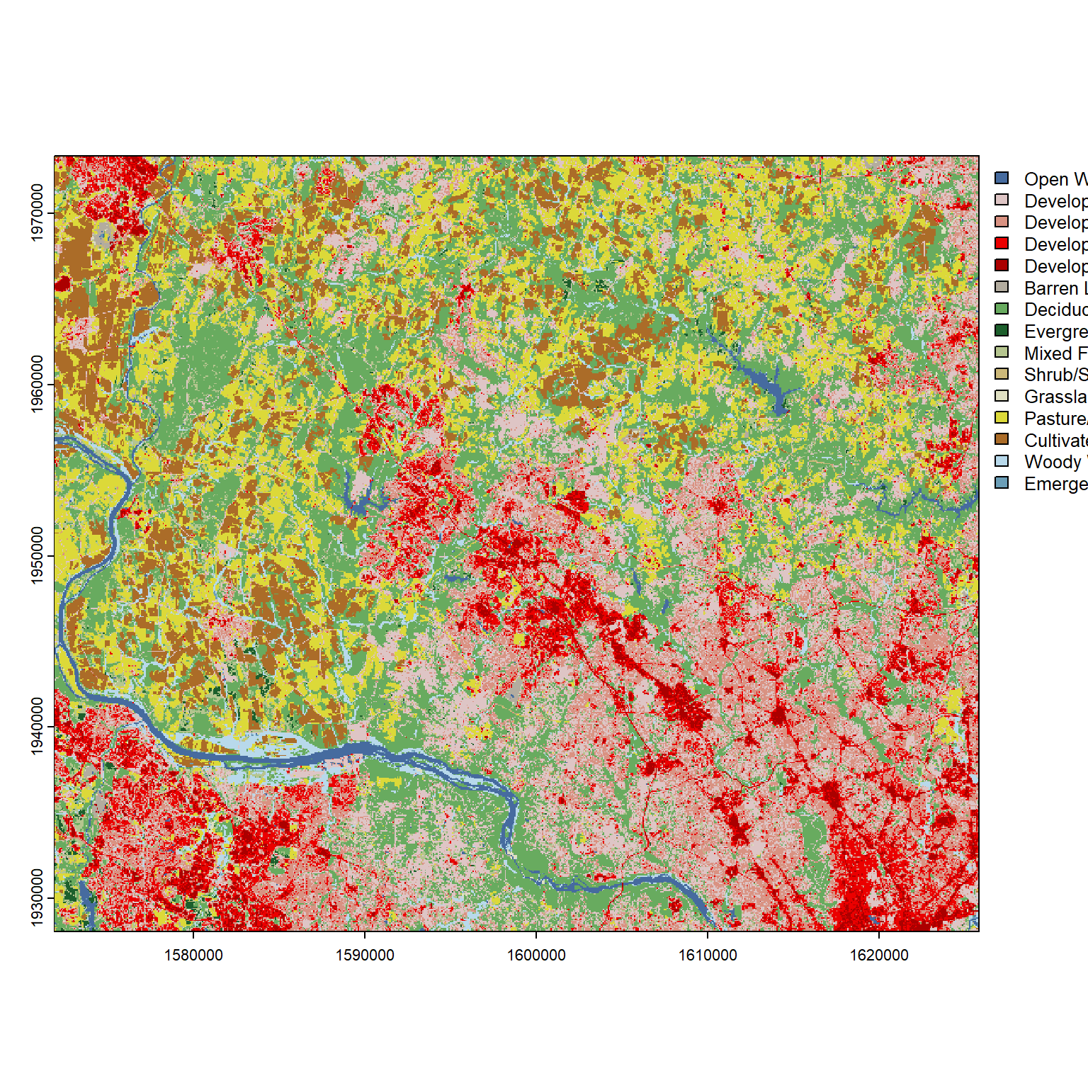
terra::plot(nlcd_sf)
Hey, that’s pretty good! At a minimum, we can see some intuitively-colored blues illustrating the Potomac River. Looking at the legend, we can see the darker reds–which reflect higher-intensity development types–concentrated in the southeastern corner. Though we inputted the boundaries for Montgomery County, we’ve received a perfect square (not the contours of Montgomery County) of raster data because the get_nlcd query effectively translated our boundaries into a bounding box–measuring the maximum extents in each direction, then returning all NLCD data within those extents.
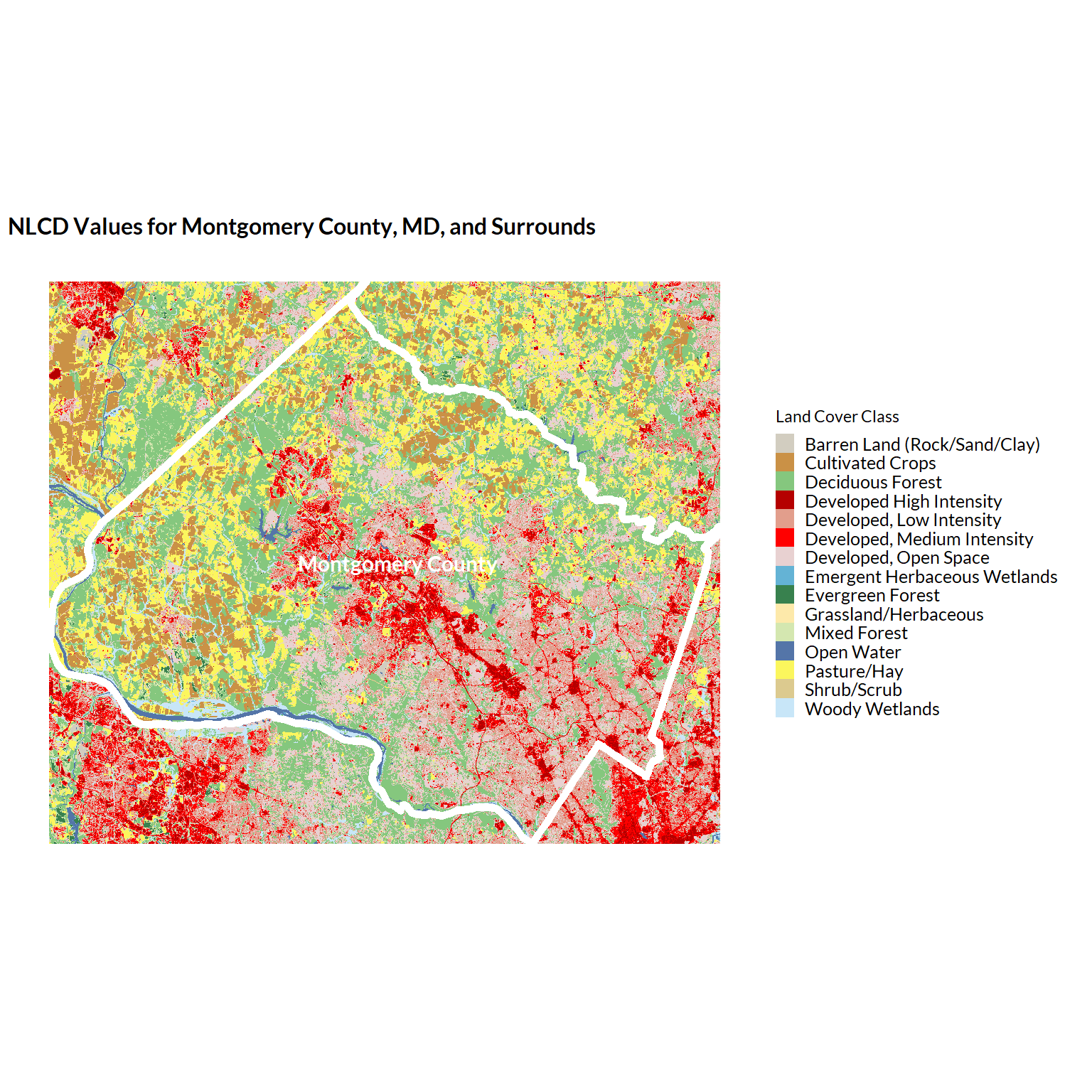
Let’s plot the Montgomery County boundaries on top of our NLCD data so we can visualize this a bit better. And let’s do so in ggplot so we can make use of that familiar and extensive API:
urbnthemes::set_urbn_defaults(style = "map")

## to use geom_raster, we need to convert our raster to a dataframe, retaining
## coordinates with the xy = TRUE argument
nlcd_sf_plotting = nlcd_sf %>%
  as.data.frame(xy = TRUE)

## we create the standard NLCD color scale for plotting (though something with
## levels of the Class variable isn't lining up quite right, which is why this
## figure has lots of dark grey)
nlcd_scale = nlcd_colors()$Color
names(nlcd_scale) = nlcd_colors()$Class

plot = ggplot() +
  geom_raster(
    data = nlcd_sf_plotting %>% left_join(pal_nlcd(), by = "Class"),
    aes(x = x, y = y, fill = Class)) +
  geom_sf(data = montgomery_county, aes(), fill = NA, color = "white", linewidth = 2) +
  geom_sf_text(data = montgomery_county, aes(label = NAMELSAD), color = "white", size = 4, fontface = "bold") +
  ggplot2::scale_fill_manual(values = nlcd_scale) +
  coord_sf(crs = projection) + ## ensure we're plotting in a standardized projection
  theme(legend.position = "right") +
  guides(fill = guide_legend(direction = "vertical")) +
  labs(
    title = "NLCD Values for Montgomery County, MD, and Surrounds",
    fill = "Land Cover Class")

plot
Not bad. We can see now exactly where Montgomery County lies within the returned NLCD raster data.
Analyzing Raster Values
While visualizing these data is handy, what if we want to summarize characteristics of the data–for example, the share of land that in Montgomery County that’s developed?
Let’s take a look:
## we can do this pretty easily by simply converting the data to a dataframe:
nlcd_sf %>%
  as.data.frame() %>% # 2712892 cells
  count(Class) %>% ## every cell is the same size, so counts are fine
  mutate(percent = prop.table(n)) %>%
  filter(str_detect(Class, "^Developed")) %>%
  summarize(across(.cols = c(n, percent), sum)) %>%
  mutate(land_area_sq_meters = n * 30)
n percent land_area_sq_meters
1 1123064 0.413973 33691920## and what if we want to look at just cells within Montgomery County's borders?
nlcd_sf %>%
terra::extract(template) %>%
as.data.frame %>% # 1458848 cells
count(Class) %>% ## every cell is the same size, so counts are fine
mutate(percent = prop.table(n)) %>%
filter(str_detect(Class, "^Developed.*Intensity")) %>%
summarize(across(.cols = c(n, percent), sum)) %>%
mutate(land_area_sq_meters = n * 30) n percent land_area_sq_meters
1 330345 0.2264424 9910350Ok, easy enough so far.
Interpolating Raster Data to Vector Data (NLCD -> Tracts)
Let’s move to an example where we want to combine raster data with vector data, e.g., to analyze the relationship between tract-level demographics and land cover.
First, we need our tract boundaries:
montgomery_tracts_sf = tigris::tracts(
  state = "MD",
  county = "Montgomery County",
  year = 2022,
  cb = T,
  progress_bar = F)
Then, we need to figure out how to interpolate values from our raster cells–which will not align perfectly–to our census tracts. First, we calculate an intersection between these two spatial objects using the exactextractr package, which offers a fast and very robust approach to this task. This returns us a long object with three columns: an id column, that corresponds to the intersecting tract; a value column, corresponding to the value of the Class attribute from our NLCD data; and a coverage_fraction variable that describes the share of the tract that falls within the intersecting cell.
## provides the polygon row number for each raster pixel x polygon intersection,
## along with the corresponding nlcd class and a coverage fraction
extract_nlcd = exactextractr::exact_extract(
  nlcd_sf,
  montgomery_tracts_sf,
  progress = F) %>%
    bind_rows(.id = "id") %>%
    as_tibble()
While our values are numeric, we don’t want to do something simplistic like average them, because the average of “high intensity development” and “lichens”… doesn’t make a lot of sense. Rather, let’s revert back to looking at development–we just want to calculate the share of the tract that is developed (one of the three Class levels that include some sort of develoment [21: Developed, Open Space doesn’t count].)
tract_shares_developed = extract_nlcd %>%
  group_by(id) %>%
  summarize(
    total = sum(coverage_fraction),
    total_developed = sum(coverage_fraction[value %in% c(22, 23, 24)]),
    percent_developed = total_developed / total) %>%
  mutate(id = as.integer(id))

tract_by_share_land_developed = montgomery_tracts_sf %>%
  mutate(id = seq_len(nrow(.))) %>% ## a join key
  left_join(tract_shares_developed, by = "id")
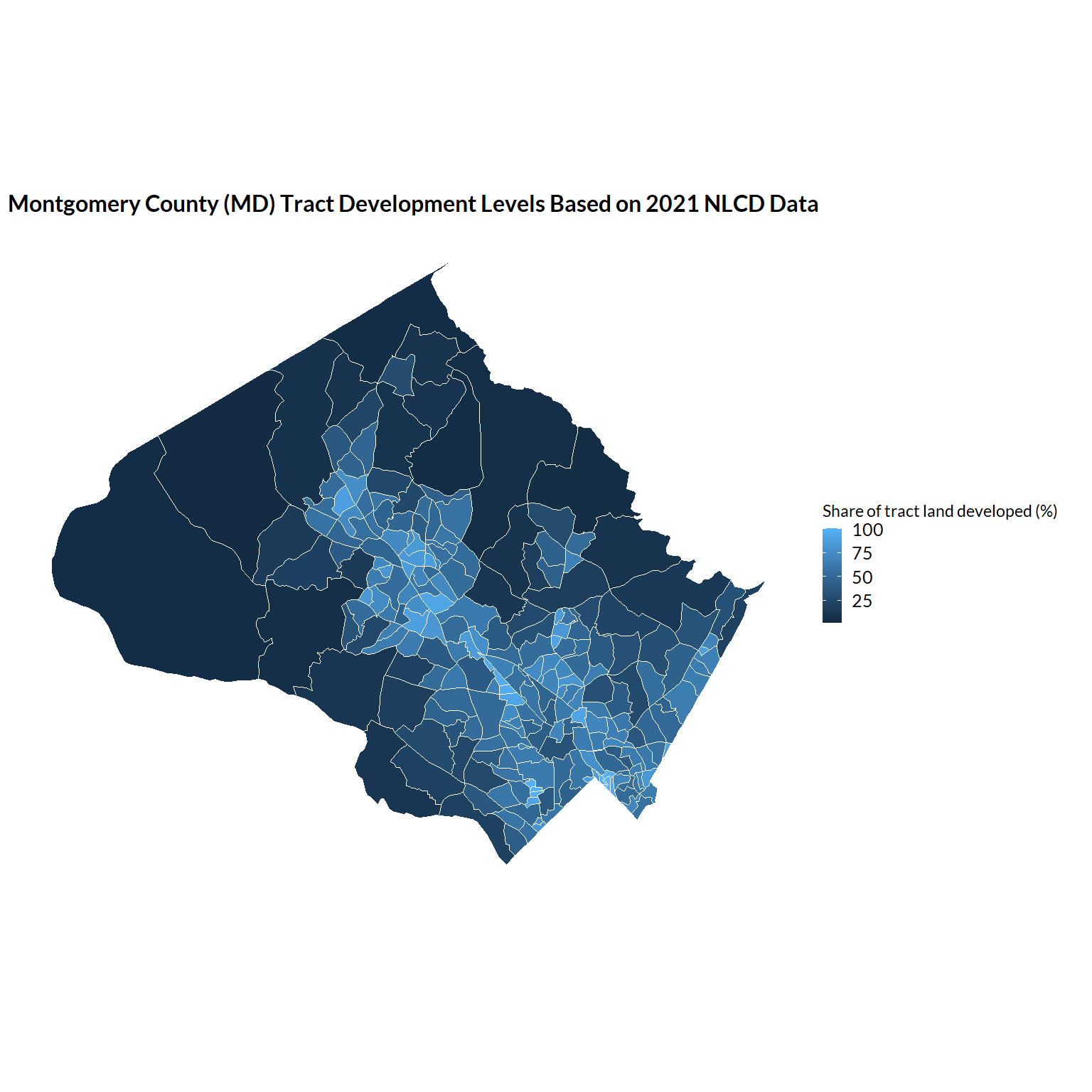
Once we’ve joined back to our tract boundaries, we can plot our (vector) data as we normally would:
ggplot(data = tract_by_share_land_developed) +
  geom_sf(aes(fill = percent_developed * 100)) +
  labs(
    fill = "Share of tract land developed (%)",
    title = "Montgomery County (MD) Tract Development Levels Based on 2021 NLCD Data")
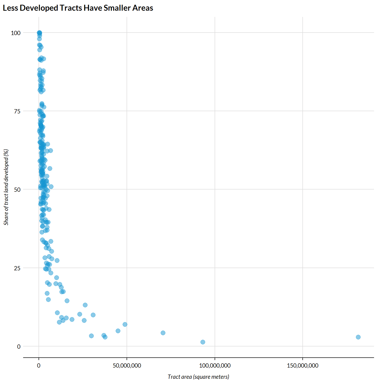
Lastly, let’s do a quick check. We know that tracts are largely defined by population, meaning that tracts have smaller land areas where population density is higher. As such, we would expect our measure of development to be fairly closely associated with tract areas, with higher shares of land developed associated with smaller tract areas:
urbnthemes::set_urbn_defaults()
tract_by_share_land_developed %>%
  mutate(area = st_area(.) %>% units::drop_units()) %>%
  ggplot() +
  geom_point(aes(x = area, y = percent_developed * 100), alpha = .5) +
  scale_x_continuous(labels = scales::comma) +
  scatter_grid() +
  labs(
    y = "Share of tract land developed (%)",
    x = "Tract area (square meters)",
    title = "Less Developed Tracts Have Smaller Areas")