16Using Custom Geographic and Demographic Datasets: Atlanta Workforce Development
Authors
Dr. Michael Rich (Emory University)
Sonia Torres Rodríguez (Urban Institute)
Alena Stern (Urban Institute)
In this case study, we show an example of how to use custom geographic and demographic datasets with the SEDT to assess how well a given program or resource is serving its specific eligible population. Specifically, this case study contrasts the locations of workers eligible for workforce training programs with the locations of workforce training providers and trainees in metropolitan Atlanta.
Case Study and Policy Background
Despite metropolitan Atlanta’s long and sustained job growth over the past forty years, Atlanta leads the nation’s largest cities in income inequality. This phenomenon has been described as the “Atlanta paradox” in a volume edited by David Sjoquist, a reference to the region’s sharp “contrast between economic growth and persistent poverty” (Sjoquist 2000).
Workforce training programs, funded through the federal government’s Workforce Innovation and Opportunity Act (WIOA), can be an important means to address this discrepancy between growth and income inequality, including by helping low-income adults transition to higher paid work, advance their careers, and achieve upward mobility. However, participation and completion rates in these programs are lower than expected and vary within metropolitan regions, raising questions about why eligible individuals are not accessing programs that could professionally and financially benefit them.
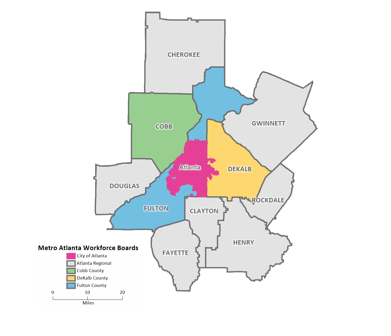
In 2019, a group of workforce development stakeholders in the greater Atlanta area, including Atlanta-based CareerRise (a regional workforce intermediary), the Atlanta Regional Commission, the five local workforce boards serving the greater Atlanta area, Emory University, and a broad group of regional stakeholders, received a multi-year grant from the Ballmer Group through the National Fund for Workforce Solutions to examine the jurisdictional barriers to economic mobility in metro Atlanta. Through a collaborative project titled Work Source Metro Atlanta, the stakeholders were able to harmonize WIOA eligibility and assessment processes through a human-centered design process involving the five workforce boards that designed and implemented a single customer-focused process. Figure 1 illustrates the jurisdictional boundaries of the five workforce boards serving the greater Atlanta area, including the City of Atlanta, Fulton County, DeKalb County, Cobb County, and Atlanta Regional, which includes seven outlying counties.
Figure 16.1
Figure 1: Greater Atlanta Metropolitan Region Workforce Boards
Additionally, administrative data from all five workforce boards are currently being consolidated and analyzed to examine how race and ethnicity, gender, and geography affect enrollment in workforce development programs, access to training providers, and labor force outcomes. Ongoing research focuses on identifying the spatial mismatch between the location of adult low-income customers who enrolled in WIOA services and the locations of available training providers.
Why Use the SEDT
Dr. Michael Rich, a professor at Emory University and member of Work Source Metro Atlanta, wanted to explore how the Spatial Equity Data Tool could support the group’s ongoing analysis of disparities in access to workforce training in the greater Atlanta area. The Urban Institute’s Spatial Equity Data Tool provides a supplemental way to assess access and enrollment disparities in workforce training across the Atlanta region. The tool is a good fit for this sort of analysis because it can easily generate a geographic and demographic distribution of the location of the eligible population and of the workforce training locations meant to serve them, as long as coordinate data are available. With the tool, it is possible to identify potential locations to open new training centers or identify areas where outreach and engagement could be increased to better reach eligible workers not yet benefiting from workforce trainings.
About the Data
The data for this case study is based on the 2018–22 five-year estimates from the American Community Survey. We pair underlying American Community Survey (ACS) baseline data with administrative data gathered from WIOA applicants and enrollees across the five workforce boards in the greater Atlanta area.
The administrative data includes 7,700 low-income adults who enrolled in skills training during the period covering January 1, 2016 through May 31, 2024. These individuals received services from 190 training providers. We focus our SEDT analysis on the 4,586 customers who were served by the workforce boards in Cobb County (n = 1,624), DeKalb County (n = 1,378), and Fulton County and the city of Atlanta (n = 1,584).
One caveat for our case study is that SEDT disparity analysis is confined to a single geography, in our case a county; in other words, providers are assumed to serve trainees within the same county. In contrast, eligible customers within the Atlanta metropolitan region can access WIOA services across multiple counties, through the workforce board in the county where they reside or where they are employed. Thus, a regional analysis would be preferable to a county-only analysis. Although not perfect, this case study shows one way to minimize a known SEDT limitation, where regional analysis is not yet possible, by showing how output from the tool can be displayed and viewed by a user for multiple counties at once to approximate a regional analysis.
Relatedly, out of our three counties of analysis, only Cobb County has a majority of its trainees stay within their own county of residence to attend workforce training programs (about 75 percent). In contrast, DeKalb and Fulton counties have only about a quarter of their trainees complete their trainings in their county of residence. For that reason, we will focus a majority of our analysis of trainee spatial distribution on Cobb County, where county-level analysis may be most instructive at identifying where it would be beneficial to expand access to workforce trainings.
Defining the WIOA Eligible Population as a Custom Geographic and Demographic Dataset
The tool has several geographic and demographic datasets built in as default options. Built-in geographic baseline datasets include the total population, the population of children, and the population living under the federal poverty level, and many demographic subgroups across three baseline populations are standard for disparity analyses (see Chapter 4 for the full list). However, with the API, users have the option to upload custom datasets for comparison depending on their analysis (see Chapter 10 for details).
To most closely align with the WIOA-eligible population, we generate a custom baseline dataset of the adult population of 18- to 64-year-olds below the federal poverty level, using 2018-22 five-year American Community Survey estimates. We will use this custom baseline dataset, which we refer to as working-age adults below the federal poverty level, when generating the geographic disparity scores.
The new custom baseline dataset is included as a custom geographic and demographic dataset in our API call, which generates the disparity scoring data. For this case study, the custom demographic data will enable us to assess whether the tracts where trainees and providers are located have a greater or smaller representation of working-age adults below the federal poverty level than the county as a whole. The geographic disparity score will compare the percentage of trainees and providers in a given census tract to the percentage of working-age adults below the federal poverty level in that same census tract.
Note that the sedtR R package makes it easy to run analyses for multiple geographies with iteration within the call_sedt_api() function, by including an option to specify a string placeholder for .csv files from different counties.
Visualizing the Demographic Distribution of Workforce Trainees
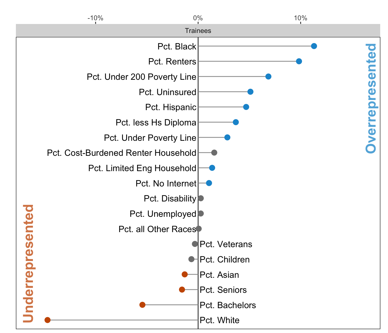
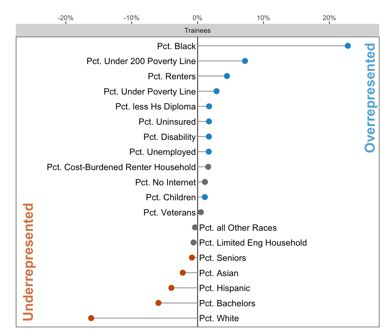
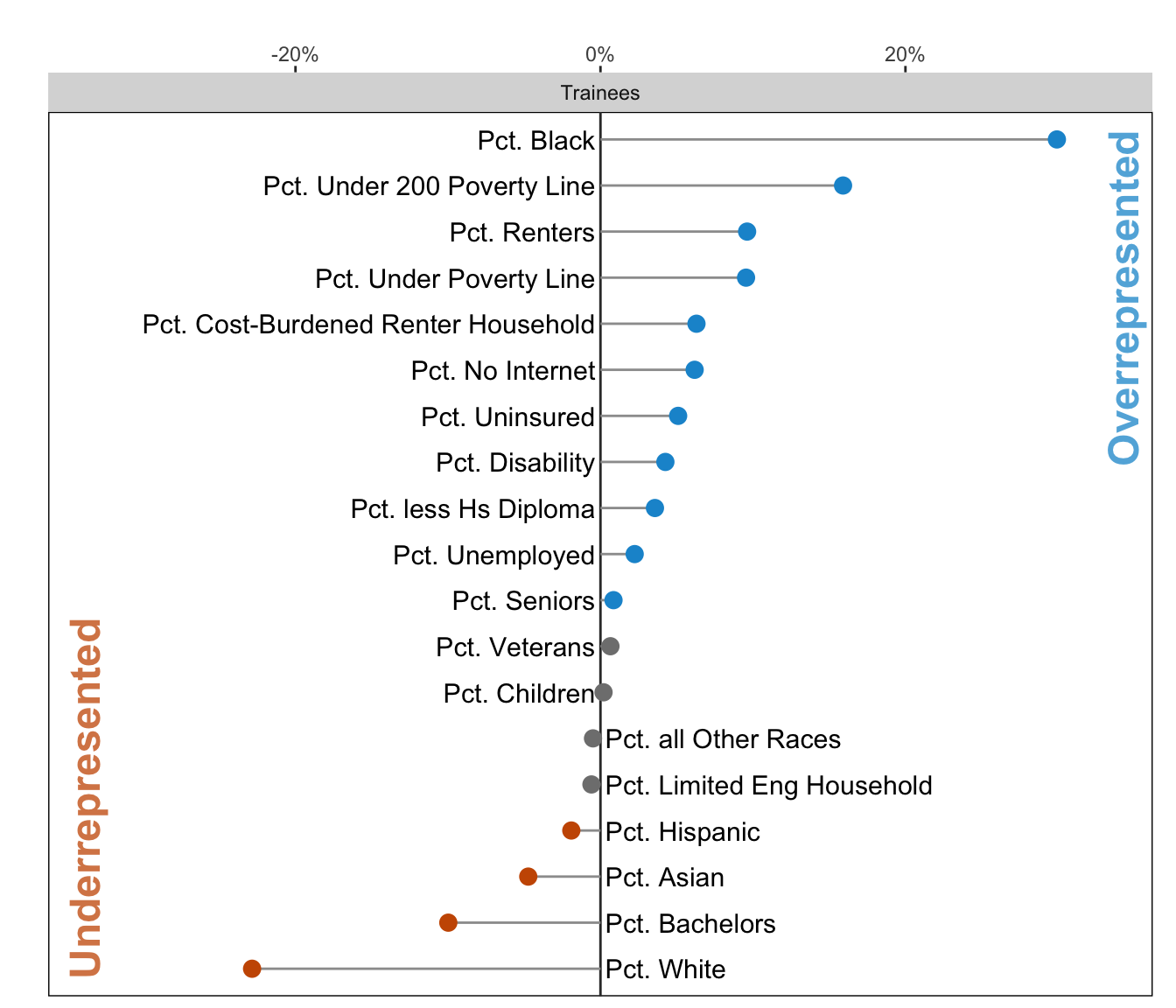
Thanks to the Urban Institute’s sedtR R package, the output from the API call can automatically be converted into static or interactive visualizations using the create_map() and create_demo_chart() functions.
Over- and underrepresentation in the demographic disparity score can be a good or bad signal, depending on the goal of the user. In the case of the locations of WIOA trainees in Cobb, Dekalb, and Fulton counties, we see that there is generally an overrepresentation of communities who are Black, renters, and live under the 200 percent of the federal poverty level, but an underrepresentation of communities who are white or have bachelor’s degrees. Across the three counties, this “over” and “under” representation shows that targeting for the WIOA program, which aims to connect with low-income workers, is doing a reasonable job of reaching its target populations.
Analyzing the Geographic Distribution of Workforce Trainees and Providers
Moving to the geographic disparity score, we utilize the custom baseline working-age adult population living below the federal poverty level. The geographic disparity score provides a useful complement to a traditional choropleth map by showing not just how many trainees come from a given tract, but also how the total number of trainees compares to the size of the eligible population.
Below, we show how the Quarto ecosystem .panel-tabset allows for the results from Cobb, DeKalb, and Fulton counties to be displayed together and toggled by the user, to approximate a regional analysis.
provider <-create_map( geo_data_all %>%filter(county =="Cobb", type =="Providers"),col_to_plot ="geo_disparity_score_percent")trainee <-create_map( geo_data_all %>%filter(county =="Cobb", type =="Trainees"),col_to_plot ="geo_disparity_score_percent")
Trainees
Providers
Code
provider <-create_map( geo_data_all %>%filter(county =="DeKalb", type =="Providers"),col_to_plot ="geo_disparity_score_percent")trainee <-create_map( geo_data_all %>%filter(county =="DeKalb", type =="Trainees"),col_to_plot ="geo_disparity_score_percent")
Trainees
Providers
Code
provider <-create_map( geo_data_all %>%filter(county =="Fulton", type =="Providers"),col_to_plot ="geo_disparity_score_percent")trainee <-create_map( geo_data_all %>%filter(county =="Fulton", type =="Trainees"),col_to_plot ="geo_disparity_score_percent")
Trainees
Providers
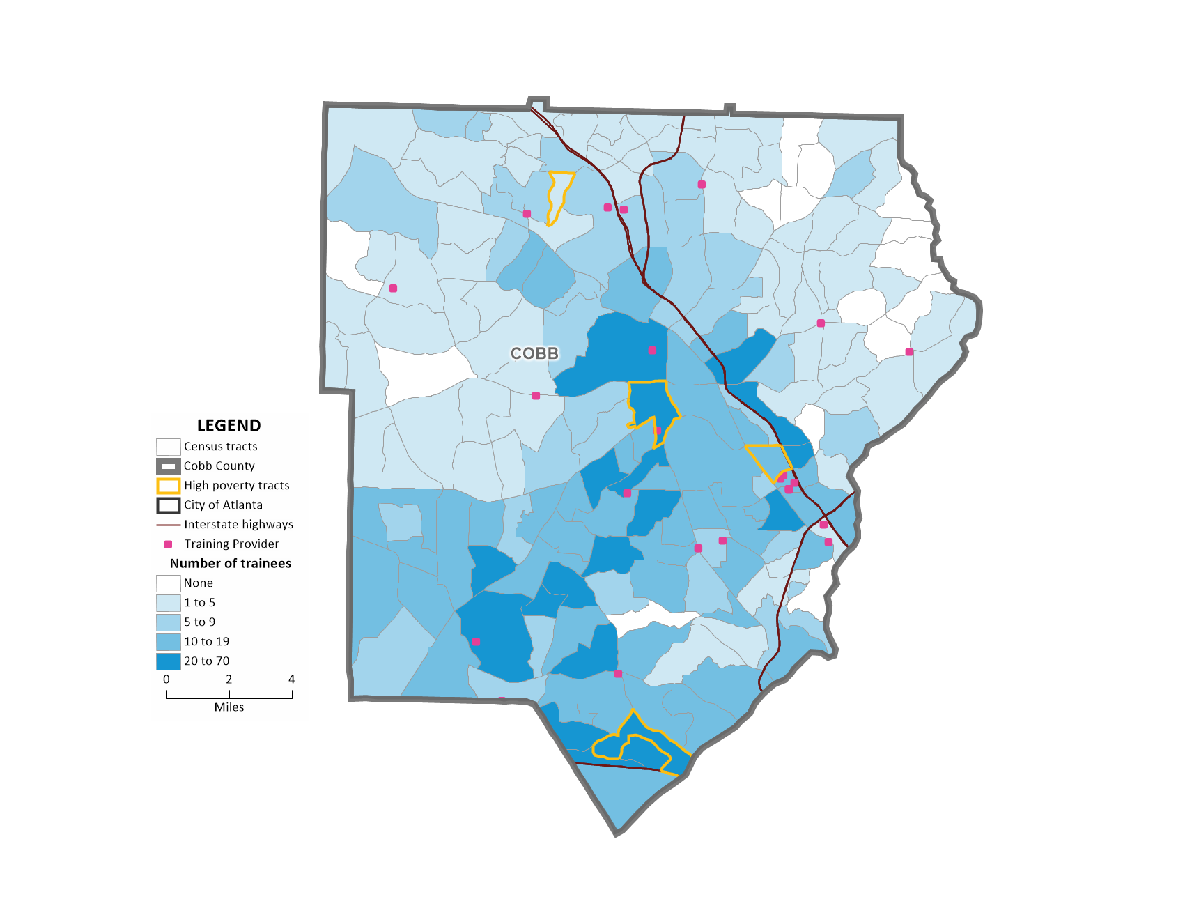
In Cobb County, where over 75 percent of trainees stay in county to access workforce training programs, the tract with the highest underrepresentation of trainees is the dark orange tract near Kennesaw on the north side of the county. In this instance, underrepresentation means that the percentage of trainees in this census tract is less than the percentage of the eligible population in this census tract.
As shown in Figure 3, this tract is located near four training locations and near one high-poverty tract. Given that there are providers located near the cluster of underrepresented tracts in the trainee map, proximity may not be the most relevant barrier to the uptake of workforce training in Cobb County. In addition to distance-based barriers, it may be worth exploring whether lack of knowledge about the training centers, mismatch between training demand and the types of trainings offered by nearby providers, or some other barrier, is a more relevant barrier for eligible trainees to access training.
Although the distribution of the providers is less interesting in this case study, given that providers serve trainees outside of their own census tract, it is interesting to note that the blue shaded overrepresented census tracts, or census tracts where there is a higher percentage of providers than the eligible population in the county in the geographic disparity map above, correctly align with the training locations included as pink dots in Figure 3. Clusters of orange tracts could also highlight areas of spatial concentration of underrepresentation, which could be considered for siting future workforce training centers.
Figure 16.2
Figure 3: Cobb County Provider Locations, Trainees by Census Tract, and High-Poverty Census Tracts
Conclusion
Using the Spatial Equity Data Tool API, we find that the demographic distribution of the trainees served in Cobb, DeKalb, and Fulton counties reflects the priorities of WIOA workforce training programs. Additionally, we identified some potential areas in Cobb County that could benefit from the addition of new locations or from greater outreach and recruitment of eligible workers.
Future extensions of this case study could include sub-setting or weighing providers and trainees by high-reward occupations, such as IT or nursing, to better understand where new trainings or recruitment efforts would be most valuable. Once the beta version of the new SEDT API travel shed functionality is expanded to cover all geographies in the US (see Chapter 19), this new functionality could be used to assess the spatial mismatch between workforce trainee and provider locations. Specifically, this new functionality could allow users to assess how accessible workforce trainings are within a 15-, 30-, or 60-minute drive shed to the WIOA eligible population.
Overall, this R-based case study demonstrates how to use custom geographic and demographic datasets with the SEDT to assess how well a given program or resource is serving its specific eligible population. It also shows how to use the tool to explore regional patterns by efficiently running analyses for multiple cities or counties using iteration with library(purrr) and library(sedtr) and displaying multiple city or county analysis side by side to facilitate easy cross-geography comparisons.
A huge thank you to our Atlanta-based partners at Work Source Metro Atlanta, particularly Dr. Michael Rich at Emory University, for their energetic and thoughtful partnership in developing this case study.