17Layering Disparity Scores with Other Measures: Washington, DC Gun Violence Prevention
Author
Rebecca John (Urban Institute)
The web version of the Spatial Equity Data Tool (SEDT) generates analysis and visualizations of the demographic and geographic distributions of a user’s uploaded resource dataset. However, these data outputs need not stand alone. The SEDT API (described in Chapter 10) allows users to perform custom analysis using the outputs of the SEDT in their preferred programming language. Below, we demonstrate how to layer a specific measure of interest on top of the tool’s disparity scores using Python and data from the District of Columbia.
Case and Policy Background
The DC Office of Gun Violence Prevention (DC OGVP) supports the coordination of Building Blocks DC, a whole-government public health strategy comprising different offices and agencies focused on preventing gun violence using place- and person-based approaches. Recognizing that violence is a multifaceted public health issue that requires a holistic strategy, Building Blocks DC supports programs that aim to reduce and prevent gun violence using a number of tactics, including community violence intervention, improving and protecting physical spaces, and addressing trauma and behavioral health. In this case study, we will focus on programs intended to create pathways to economic opportunity.
Research has found that social determinants of health, including economic opportunity and wealth, are related to gun violence (Kim 2017). To address this, the District works to increase access to economic opportunity and remove barriers to employment through programs like the Office of Neighborhood Safety and Engagement’s (ONSE) Pathways program and the Department of Employment Service’s (DOES) Project Empowerment, which equip participants with training focused on job and life skills, subsidized employment, and support in finding and keeping permanent employment.
Why Use the SEDT
To most effectively target outreach efforts for these employment skills programs, DC OGVP is interested in finding areas of the city that have a high need for these programs and in understanding the demographic groups most affected by gun violence. Building on areas the District already has selected as high priority, such as the ONSE Priority Communities, we focus on identifying areas that would benefit the most from employment-centered outreach efforts based on data from the American Communities Survey (ACS).
Using the SEDT, we can identify areas that experience particularly high levels of gun-related crimes relative to their share of the DC population using geographic disparity scores and deepen the analysis by layering those results with unemployment data. Combining SEDT outputs with unemployment data, we can locate areas that have disproportionately high levels of violence and unemployment, compare these areas to ONSE’s Priority Communities, and identify areas in the city that could be candidates for the expansion of these programs.
About the Data
The datasets that we will use in the SEDT API call are
gun violence incidents in DC, and
census tract-level unemployment rate.
Later, we will also use the following DC polygon data for comparison:
ONSE Priority Communities
The 2023 gun violence data come from DC Crime Cards, a public source of DC police data. DC OGVP often works with this information on crime as the baseline for exploring other datasets. The data have columns for latitude, longitude, census tract GEOID, and crime description, among other measures. We will filter by offense type to focus on violent crime for our analysis. Since the crime data come with latitude and longitude columns, no additional preprocessing is required to use it with the API.
The unemployment data come from the US Census Bureau’s ACS. We acquired this data using the Census API. The data have columns for census tract GEOID, the number of unemployed people, and the number of people in the labor force. We use these columns to calculate the unemployment rate by census tract.
The ONSE Priority Communities are DC neighborhoods that have been identified as in need of ONSE’s work, which includes the employment-based Pathways program mentioned earlier, as well as programming involving community violence intervention and family and survivor support. We will use these Priority Communities to represent areas that are already considered high priority and receiving gun violence prevention support.
The Office of the Attorney General hosts Cure the Streets, which is a program that uses a data-driven public health strategy to interrupt, treat, and stop the spread of gun violence. While we do not include the Cure the Street service areas in the rest of this case for simplicity, we used these polygon data during our exploratory analysis process. Cure the Street’s data dashboard can be found here.
Using the SEDT API for Custom Analysis
Using the SEDT API, we can upload DC crime data to find areas that have disproportionately high levels of violence via the SEDT geographic disparity scores. We can also assess the composition of communities most affected by violence across the city as a whole with the demographic disparity scores.
After generating SEDT disparity scores with the API, we can compare the areas with high geographic disparity scores with ONSE Priority Communities. Lastly, we will layer unemployment data to find areas that have both high geographic disparity scores and high levels of unemployment:
Select baseline dataset for comparison
Upload crime data to SEDT API to obtain geographic and demographic disparity scores
Assess disparity scores
Compare results with ONSE Priority Communities
Identify areas with both high geographic disparity and high unemployment
Select Baseline Dataset for Comparison
The SEDT methodology compares the distribution of uploaded data, in our case, instances of gun-related crime, with the distribution of a baseline dataset from the ACS. The API constructs geographic disparity scores and demographic disparity scores based on this comparison. You can read more about the construction of these scores in Chapter 3.
The ACS baseline dataset we choose to compare with our dataset of interest will affect the interpretation of our analysis. The tool has a number of baseline datasets as default options, including the total population, the population of children, and the population living under the federal poverty level. However, with the API, users have the option to upload custom datasets for comparison depending on their analysis. In our case, we are interested in identifying the areas that have disproportionately high levels of gun violence. The question then becomes, “Disproportionate to what?”
If we choose to compare the crime data to the total population as our baseline dataset, the geographic disparity scores would tell us the difference between the percentage of all gun-related crime that occurred in a particular census tract and the percentage of the total DC population living in that same census tract. That is, high disparity scores would tell us that the percentage of DC crime that occurred in a census tract is disproportionately high compared with its share of the overall DC population. Since we are interested in unemployment, a user might consider uploading the population of unemployed residents as a custom baseline dataset in the API call.
A helpful question to ask when choosing a baseline dataset is, “Which population is most affected by my data?” For example, if we were looking at playgrounds, we would choose a baseline population of children. Since gun violence affects everyone, we choose to use total population as our baseline dataset. To gain insight into the unemployed population, we can layer that data on top of the tool’s output. This allows us to identify the areas with the most disproportionately high levels of gun-related violence in the District overall and then find the overlap with areas with the highest levels of unemployment.
Code
import requestsimport jsonimport pandas as pdimport geopandas as gpdimport timepd.set_option('display.max_columns', None)# upload link for SEDT APIupload_url ="https://equity-tool-api.urban.org/api/v1/upload-user-file/"payload = {"resource_lat_column": "LATITUDE","resource_lon_column": "LONGITUDE","geo": "city","acs_data_year": "2022"}# load DC crime datacrime_cards = pd.read_csv("data/dc-ogvp/dc-crimes-search-results.csv")# filter to gun-related crimesgun_crime = crime_cards.query('offensekey == "violent|assault w/dangerous weapon" | offensekey == "violent|homicide"')# output gun-related crime datagun_crime.to_csv('data/dc-ogvp/gun_crime.csv', index=False)# reference resource file for API callresource_file =open('data/dc-ogvp/gun_crime.csv')# API callr = requests.post( upload_url, data = payload, files = {"resource_file": resource_file})response_string = r.content.decode("utf-8")response_dict = json.loads(response_string)file_id = response_dict["file_id"]# check whether SEDT has finished processing requeststatus_url ="https://equity-tool-api.urban.org/api/v1/get-output-data-status/"full_url = status_url + file_id +"/"response = requests.get(full_url)content = json.loads(response.content)# view the output in a more clean way:content_dump = json.dumps(content, indent =4)# wait for SEDT to finish runningtime.sleep(10)# get responseoutput_data_url ="https://equity-tool-api.urban.org/api/v1/get-output-data/"full_url = output_data_url + file_id +"/"response = requests.get(full_url)content = json.loads(response.content)# create demographic disparity DataFramedem = content["results"]["result"]["demographic_bias_data"]dem_df = pd.DataFrame(dem)# create geographic disparity DataFramegeo = content["results"]["result"]["geo_bias_data"]["features"]geo_df = gpd.GeoDataFrame.from_features(geo)
Assess and Plot Demographic Disparity
Code
import matplotlibimport matplotlib.pyplot as pltfrom matplotlib.lines import Line2Dimport osimport numpy as np# define repeated colorsyellow ='#fdbf11'blue ='#1696d2'# create dictionary of labels to match with column nameslabel_dict = {"pct_no_internet": "Without Internet Access","pct_under_200_poverty_line": "Under 200% of Poverty Line","pct_all_other_races": "All other races","pct_less_hs_diploma": "Without a High School Diploma","pct_black": "Black","pct_white": "White","pct_asian": "Asian","pct_children": "Children","pct_seniors": "Seniors","pct_veterans": "Veterans","pct_unins": "Uninsured","pct_disability": "With a Disability","pct_renters": "Renters","pct_limited_eng_hh": "Limited English Proficiency","pct_bach": "With Bachelors Degree","pct_under_poverty_line": "Under the Poverty Line","pct_cb_renter_hh": "Cost Burdened Renter Households","pct_unemp": "Unemployed","pct_labor_force": "In Labor Force","pct_hs_diploma": "With HS Diploma","pct_more_than_30_min_commute": "More than 30 Minute Commute","pct_workers_no_vehicle_in_household": "Workers with no Vehicle in Household","pct_renter_extreme_rent_burden": "Extremely Rent-Burdened Renters","pct_people_in_state_prison": "People in State Prison","pct_pov_children": "Children in Poverty","pct_under18_white_alone": "White (non-Latinx) Children","pct_under18_hisp": "Latinx Children","pct_pov_black_alone": "Black Residents (non-Latinx) Living in Poverty","pct_hisp": "Latinx","pct_under18_all_other_races_alone": "Children of Another Race or Ethnicity (non-Latinx)","pct_under18_limited_eng_hh": "Households with Children and Limited English Proficiency","pct_pov_all_other_races_alone": "Residents in Poverty of Another Race or Ethnicity (non-Latinx)","pct_pov_hisp": "Latinx Residents Living in Poverty","pct_pov_less_than_hs": "Residents Living in Poverty without a HS Diploma","pct_pov_unemployed": "Unemployed Residents in Poverty","pct_pov_asian_alone": "Asian Residents (non-Latinx) Living in Poverty","pct_pov_veterans": "Veterans Living in Poverty","pct_under18_disability": "Children with a Disability","pct_under18_unins": "Uninsured Children","pct_under18_asian_alone": "Asian (non-Latinx) Children","pct_pov_unins": "Uninsured Residents Living in Poverty","pct_under18_pov": "Children Living in Poverty","pct_pov_seniors": "Seniors Living in Poverty","pct_pov_bach": "With Bachelor's Degree Living in Poverty","pct_pov_disability": "Residents with a Disability Living in Poverty","pct_pov_white_alone": "White (non-Latinx) Residents Living in Poverty","pct_under18_black_alone": "Black (non-Latinx) Residents Living in Poverty"}# sort by demographic disparity scoresdem_df = dem_df.sort_values(by ="diff_data_city")# filterdem_df = dem_df[~dem_df['census_var'].str.startswith('pct_pov')]dem_df = dem_df[~dem_df['census_var'].str.startswith('pct_under18')]# create y-axis rangey_range =range(1, len(dem_df.index)+1)# set figure sizeplt.figure(figsize=(5.3, 4.8))# create horizontal lines for lollipop chartplt.hlines(y = y_range, xmin =0, xmax = dem_df['diff_data_city'], color ='grey', alpha =0.4, zorder =1)# set plot colors based on statistical significanceplot_colors = np.where((dem_df['diff_data_city'] <0) & (dem_df['sig_diff'] ==True), yellow, np.where((dem_df['diff_data_city'] >0) & (dem_df['sig_diff'] ==True), blue, "grey"))# create dots for lollipop chartplt.scatter(dem_df['diff_data_city'], y_range, color = plot_colors, alpha =1, label = dem_df['census_var'])# create column with labels for y-axisdem_df['y_label'] = dem_df['census_var'].replace(label_dict)# create y-axisplt.axvline(x =0, color ='black')y_labels = dem_df['y_label']# add y-axis labelsplt.yticks(y_range, y_labels)# add overall plot titleplt.title('Demographic Disparity Analysis')# add x-axis labelplt.xlabel('Demographic Disparity Score (%)')# create legend for statistical significance color differencescustom_legend = [ Line2D([0], [0], marker ='o', color ='w', markerfacecolor = yellow, markersize =8, label ='Underrepresented'), Line2D([0], [0], marker ='o', color ='w', markerfacecolor = blue, markersize =8, label ='Overrepresented'), Line2D([0], [0], marker ='o', color ='w', markerfacecolor ='grey', markersize =8, label ='Not Statistically Significant')]plt.legend(handles = custom_legend, loc ='lower right', fontsize ='small')# display plotplt.show()
Note
We use “Latinx” to refer to people of Latino or Hispanic origin as asked by the Census. We recognize that this gender-neutral term may not be the preferred identifier for many, but we use it to remain inclusive of gender nonconforming and nonbinary people.
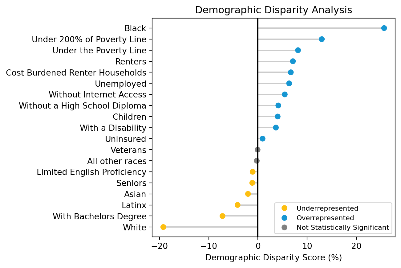
Evaluating the demographic disparity scores, we can see that areas with higher concentrations of Black residents are exposed to gun-related violence at a disproportionately high rate compared with the overall population in the District. When reviewing demographic disparity scores, it is important to understand the role of structural inequities driving current disparities. Structural racism and historic disinvestment provide important context for our disparity scores on gun-related crime. Race is a social construct, and “no racial group is inherently more violent than any other.” (Chaplin et al. 2022). For this reason, DC OGVP is interested in looking at the role of economic factors in gun-related crime. Reviewing the demographic disparity scores, we can see that residents living under 200 percent of the federal poverty level are also disproportionately exposed to gun-related crime in their neighborhoods.
In general, having this demographic disparity data on community outcomes is important in order to conduct racial equity impact assessments, especially given incidents of gun violence is a racial equity indicator in the DC Racial Equity Action Plan. While the demographic disparity scores provide insight into racial and ethnic groups’ levels of exposure to incidences of gun violence in the District, they do not show which areas of DC experience particularly high level of gun violence. The geographic disparity scores provide this insight.
Assess and Plot Geographic Disparity
Using the SEDT API output, we can plot the geographic disparity scores on a map to visualize the areas with the highest positive disparity scores, indicating a disproportionately high exposure to gun violence compared with their share of the total population. While many areas with high geographic disparity scores appear throughout Southeast DC, a historically marginalized quadrant of the District, some key areas in Northeast and Northwest DC are also highlighted on the map.
Code
from census import Censusfrom dotenv import load_dotenvimport osimport matplotlibimport foliumimport matplotlib.colors as mcolorsimport branca.colormap as bcm# load environment variables from .env fileload_dotenv()# get Census API key from environment variableapi_key = os.getenv('CENSUS_API_KEY')# initialize Census APIc = Census(api_key)# load unemployment datadc_unemployment = c.acs5.state_county_tract( fields=['B27011_008E', 'B27011_002E'], state_fips='11', county_fips='001', tract='*', year=2022)# convert to DataFramedc_unemployment_df = pd.DataFrame(dc_unemployment)# rename columns for claritydc_unemployment_df.rename( columns={'B27011_008E': 'unemployed', 'B27011_002E': 'labor_force'}, inplace=True)# calculate unemployment ratedc_unemployment_df['unemployment_rate'] = dc_unemployment_df['unemployed'] / dc_unemployment_df['labor_force']# format GEOID for mergedc_unemployment_df['GEOID'] ='11001'+ dc_unemployment_df['tract'].astype(str)# output unemployment datadc_unemployment_df.to_csv('data/dc-ogvp/dc_unemployment.csv', index=False)# prepare DC unemployment datadc_unemployment = pd.read_csv("data/dc-ogvp/dc_unemployment.csv")dc_unemployment["GEOID"] = dc_unemployment["GEOID"].astype(str) # merge unemployment data with geographic disparity scores on census tract (GEOID)combined_df = geo_df.merge(dc_unemployment, on ="GEOID")# round for map legend and tooltipscombined_df.loc[:, 'diff_pop'] =round(combined_df['diff_pop'] *100, 2)combined_df.loc[:, 'unemployment_rate'] =round(combined_df['unemployment_rate'] *100, 1)# prepare data for mappingcombined_gdf = combined_df.set_crs(crs =4326, allow_override =True)# define center of maplatitude =38.89511longitude =-77.03637# create base mapm = folium.Map(location=[latitude, longitude], tiles="CartoDB positron", zoom_start=11)# read in DC border for map outlinedc_border = gpd.read_file('data/dc-ogvp/Washington_DC_Boundary.geojson')# create DC border layerdc_map_outline = dc_border.explore( m = m, color ='none', edgecolor ='black', interactive =False, style_kwds={'fillOpacity': 2, 'color': 'black', 'weight': 1})# normalize data to create diverging colormap centered at 0vmin = combined_gdf["diff_pop"].min()vmax = combined_gdf["diff_pop"].max()norm = mcolors.TwoSlopeNorm(vmin=vmin, vcenter=0, vmax=vmax)# load PuOr color mapcmap = plt.get_cmap('PuOr')# create column with PuOr hexcodes based on normalized datacombined_gdf['norm_hex'] = combined_gdf['diff_pop'].apply(lambda x: mcolors.rgb2hex(cmap(norm(x))))# create function to style each featuredef style_function(feature):return {'fillColor': feature['properties']['norm_hex'], # color fill scale'color': 'black', # outline color'weight': 0.3, # outline weight'fillOpacity': 0.7, # outline opacity }# add disparity score layer with the custom stylefolium.GeoJson( combined_gdf, style_function=style_function, tooltip=folium.GeoJsonTooltip( fields=["tract", "diff_pop", "unemployment_rate"], aliases=['Census Tract ID:', 'Geographic Disparity Score (%)', 'Unemployment Rate (%)'] )).add_to(dc_map_outline)# label interval for custom legendintervals = [round(i *0.2, 1) for i inrange(int(vmin /0.2), int(vmax /0.2) +1)]if0notin intervals: intervals.append(0)intervals =sorted(intervals)# corresponding colors for legend label intervalscolors = [mcolors.rgb2hex(cmap(norm(i))) for i in intervals]# create custom legendlegend = bcm.LinearColormap( colors=colors, vmin=vmin, vmax=vmax, index=intervals, caption='Geographic Disparity Score (%)')# add to maplegend.add_to(m)# display mapm
Make this Notebook Trusted to load map: File -> Trust Notebook
Comparison with ONSE Priority Communities
We have seen that SEDT geographic disparity scores allow us to examine the distribution of gun violence compared with the distribution of the DC population. To identify areas with the most disproportionately high levels of gun violence, we isolate the tracts with the highest geographic disparity scores. The map below plots the census tracts with geographic disparity scores above the 80th percentile in purple.
Code
# load ONSE priority areasonse_priority_file ='data/dc-ogvp/onse-priority-communities.geojson'priority_areas = gpd.read_file(onse_priority_file)priority_areas_gdf = priority_areas.set_crs(crs =4326, allow_override =True)# find the 20% of tracts with the most extreme geographic disparity scorespctile_80_geog_disp_score = combined_df["diff_pop"].quantile(.80)top_geog_disp = combined_df[(combined_df["diff_pop"] > pctile_80_geog_disp_score)]# prepare data for mappingtop_geog_disp[["GEOID", "diff_pop", "unemployment_rate"]]top_geog_disp_gdf = top_geog_disp.set_crs(crs =4326, allow_override =True)# define center of maplatitude =38.89511longitude =-77.03637# create base mapm = folium.Map(location=[latitude, longitude], tiles="CartoDB positron", zoom_start=11)# read in DC border for map outlinedc_border = gpd.read_file('data/dc-ogvp/Washington_DC_Boundary.geojson')# create DC border layerdc_map_outline = dc_border.explore( m = m, color ='none', edgecolor ='black', interactive =False, style_kwds={'fillOpacity': 2, 'color': 'black', 'weight': 0.7})# add map layer with top geographic disparity quintile areastop_geog_disp_map = top_geog_disp_gdf.explore( m = dc_map_outline, color ="#7A5DA3", tooltip = ["tract", "diff_pop", "unemployment_rate"], tooltip_kwds = {'aliases': ['Census Tract ID:', 'Geographic Disparity Score (%)', 'Unemployment Rate (%)']}, style_kwds={'fillOpacity': 0.7, 'color': 'black', 'weight': 0.3})# ONSE priority area mappriority_areas_gdf.explore( m = top_geog_disp_map, tooltip = ["Title"], tooltip_kwds = {'aliases': ['ONSE Priority Community']}, color = yellow, style_kwds={'fillOpacity': 0.7, 'color': 'black', 'weight': 0.3})# add custom legendlegend_html ='''<div style="position: fixed; bottom: 50px; left: 50px; width: 200px; height: 42px; border:2px solid grey; z-index:9999; font-size:14px; background-color:white; opacity: 0.8;"> <i style="background: #7A5DA3; width: 18px; height: 18px; float: left; margin-right: 8px;"></i> High Geographic Disparity<br> <i style="background: #fdbf11; width: 18px; height: 18px; float: left; margin-right: 8px;"></i> ONSE Priority Community</div>'''# add legend to mapm.get_root().html.add_child(folium.Element(legend_html))# display mapm
Make this Notebook Trusted to load map: File -> Trust Notebook
While reviewing this map, DC subject-matter experts were initially surprised that census tract 10700, encompassed within Downtown DC, was included in the areas with disproportionately high gun violence. Upon further review, it became clear the high geographic disparity score was driven by the low residential population in this commercial area, rather than the level of gun-related crime. While this census tract does not pass through our filter for high unemployment rate shown in the next section, this observation highlights the importance of ground-truthing analysis from the tool and gut checking outliers with population levels.
As previously discussed, several offices within DC government have already highlighted specific communities as high-priority neighborhoods to target for service. ONSE Priority Communities are among these. On the map above, these areas are plotted in yellow. These ONSE Priority Communities have been selected based on community-sourced knowledge and local police data, among other factors. The map demonstrates a strong overlap between the ONSE Priority Communities and the areas with high SEDT geographic disparity scores. This makes sense as data on gun violence is a key factor in the analysis underlying their creation.
ONSE and other DC offices coordinate a wide array of violence prevention efforts, all addressing the multifaceted issue of gun violence from different angles. We are particularly interested in highlighting possible areas that are not currently targeted by these programs but that could benefit from programming focused on boosting employment and economic opportunity. Merging the geographic disparity scores with Census unemployment data adds our key measure to the analysis and enables us to find our areas of interest.
Layering Unemployment Data with Geographic Disparity
Building on our analysis thus far, we can use unemployment data to more directly target areas that would benefit from Building Blocks DC’s and ONSE’s employment-centered interventions. So far, we have identified areas that have disproportionately high levels of gun violence. By isolating the census tracts with the highest levels of unemployment and their intersection with the tracts with the highest disparity scores, we can identify new priority areas to inform potential expansion efforts of Pathways and Project Empowerment.
We can accomplish this by collecting unemployment data from the Census API, filtering for the census tracts with unemployment rates higher than the 80th percentile, and plotting their overlap with those census tracts with geographic disparity scores above the 80th percentile from the previous section. By mapping the areas with the most extreme geographic disparity scores and the highest levels of unemployment, we can drill down to the subset of priority areas that would benefit most from these specific economic opportunity programs. On the map below, these areas of interest are plotted in blue.
Code
# find the 20% of tracts with the highest unemployment ratespctile_80_unemployment = combined_df["unemployment_rate"].quantile(.80)# merge with highest disparity scores to find intersectiontop_quintile_both = combined_df[(combined_df["diff_pop"] > pctile_80_geog_disp_score) & (combined_df["unemployment_rate"] > pctile_80_unemployment)]top_quintile_both[["GEOID", "diff_pop", "unemployment_rate"]]# output new target areastop_quintile_both.to_csv("data/dc-ogvp/potential_target_areas.csv")# round for map legend and tooltipstop_quintile_both.loc[:, 'diff_pop'] =round(top_quintile_both['diff_pop'], 2)top_quintile_both.loc[:, 'unemployment_rate'] =round(top_quintile_both['unemployment_rate'], 1)# prepare data for mappingtop_crime_unemployment_gdf = top_quintile_both.set_crs(crs =4326, allow_override =True)# define center of maplatitude =38.89511longitude =-77.03637# create base mapm = folium.Map(location=[latitude, longitude], tiles="CartoDB positron", zoom_start=11)# read in DC border for map outlinedc_border = gpd.read_file('data/dc-ogvp/Washington_DC_Boundary.geojson')# create DC border layerdc_map_outline = dc_border.explore( m = m, color ='none', edgecolor ='black', interactive =False, style_kwds={'fillOpacity': 2, 'color': 'black', 'weight': 0.7})# base map layer with top unemployment/crime quintile areascrime_unemployment_map = top_crime_unemployment_gdf.explore( m = dc_map_outline, color=blue, tooltip=["tract", "diff_pop", "unemployment_rate"], tooltip_kwds={'aliases': ['Census Tract ID:', 'Geographic Disparity Score (%)', 'Unemployment Rate (%)']}, style_kwds={'fillOpacity': 0.7, 'color': 'black', 'weight': 0.3})# ONSE priority area mappriority_areas_gdf.explore( m=crime_unemployment_map, tooltip=["Title"], tooltip_kwds={'aliases': ['ONSE Priority Community']}, color=yellow, style_kwds={'fillOpacity': 0.7, 'color': 'black', 'weight': 0.3})# custom legendlegend_html ='''<div style="position: fixed; bottom: 50px; left: 50px; width: 200px; height: 62px; border:2px solid grey; z-index:9999; font-size:14px; background-color:white; opacity: 0.8;"> <i style="background: #1696d2; width: 18px; height: 18px; float: left; margin-right: 8px;"></i> High Geographic Disparity<br> <span style="margin-left: 26px;">& High Unemployment</span><br> <i style="background: #fdbf11; width: 18px; height: 18px; float: left; margin-right: 8px;"></i> ONSE Priority Community</div>'''# add legend to mapm.get_root().html.add_child(folium.Element(legend_html))# display the mapm
Make this Notebook Trusted to load map: File -> Trust Notebook
Overall, our analysis reaffirms that the ONSE Priority Communities are located in areas with disproportionately high levels of gun-related crime and have need for violence prevention services. As we filter by unemployment, we notice some of the previously overlapping ONSE Priority Communities are no longer included in our new areas of interest. This indicates that these areas were likely chosen for their need for other nonemployment-based ONSE programs, such as violence interruption efforts. To find new areas of interest for potential program expansion, we filter to those areas that have high geographic disparity scores, high unemployment rates, and are not current ONSE Priority Communities. Filtering in this way shows additional areas in Northeast and Southeast DC that could benefit from joint community and government dialogue about how and what employment-centered programs could be expanded or improved in those communities.
Conclusion
Using the Spatial Equity Data Tool API, we find the census tracts that have the most disproportionately high levels of violence and high levels of unemployment, lie, predominately but not exclusively, in East and Southeast DC. By identifying the locations and demographics of these areas, DC OGVP can consider the deployment of resources to these target areas to bolster outreach and find new areas to serve.
This Python-based case study demonstrates that it is possible to layer the disparity scores created by the SEDT with other key metrics to deepen analysis. If you have identified geographic areas of interest, this case study offers a guide in using SEDT API output for comparison.
We thank the hard-working DC government teams in the Office of Gun Violence Prevention, the Office of Racial Equity, the Office of Neighborhood Safety and Engagement, and the Office of the Attorney General for their thoughtful and engaging partnership during the development of this case study.
Kim, Daniel. 2017. “Social Determinants of Health in Relation to Firearm-Related Homicides in the United States: A Nationwide Multilevel Cross-Sectional Study.”PLOS Medicine 16 (December): 1–26. https://doi.org/10.1371/journal.pmed.1002978.